Designed for Gathering

A simple kitchen update evolved into a full-home transformation at Smith Mountain Lake, where thoughtful design, family antiques, and lakefront views create a space built for entertaining.

By: Megan Williams / Photos By: Ashlee Glen

It all started with a conversation homeowners will recognize all too quickly. Jeff Allen and his daughter, Daphne, realized there was one small improvement that could be made to their kitchen space to allow for easier entertaining.

“Then it all snowballed from there,” Allen laughed.

One small shift to make space for a double trashcan led to myriad “what if” conversations. What if we open up this space? What if we had more light in the kitchen? What if this space didn’t just allow for family gatherings, but entertaining the way we want to entertain? 

So Daphne called her longtime friend Mady Perillo, co-owner of Greer Design Co.

“Mady really started with a blank slate,” Allen explained. “A lot of what you see here was Mady and her vision.”

Allen’s lakefront home was originally built in the 1990s and it was largely established as a summer home—a quiet retreat that a young family could escape to. As the family grew, got older, and needs shifted, Allen and his brother worked together to add on to the home—adding a large basement den and primary bedroom and bathroom. Then, it became a full-time home for the first time.

When Allen reached out to Greer Design, he was largely still in the Lynchburg area but also traveling back and forth between Smith Mountain Lake and St. Pete, Florida, where he and his wife, Lynette, have another residence.

“From the beginning, our focus was on creating a home that felt bright, welcoming, and comfortable as the home previously was quite dark,” Perillo explained. “Our clients are wonderful entertainers, so making guests feel special was a top priority. Their love of coastal-inspired colors, paired with our passion for creating distinctive and memorable spaces, led us to design each room with its own personality while keeping the overall feel bright, relaxed, and cohesive.”

“Some things were still dated from the 90s and from the addition,” continued Allen. “So we tasked Mady with doing a makeover to who we are today, not when our kids were little.”

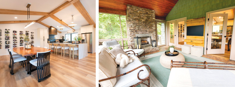
And indeed, the home is instantly warm, bright, and welcoming—with conversational nooks and space strategically placed to welcome conversation or to allow large groups of people to spread out. As you walk through the front door, you’re immediately met with an open kitchen. A large island—perfect for many elbows and drink glasses to gather—rests as the focal point of the space before the eye wanders to the dining area and the custom wine wall the Greer Design Co. team had installed. As you walk through the space, you’ll notice that the eye naturally knows which area to focus on next. The wine wall gives way to the screened in porch, where the oversized furniture all but beckons visitors to stretch out and stay a while. From there, a welcome wander to the opposite wall, where large prints of priceless family photos are framed in a grid invite you back inside where the air is cool and the drinks are being poured. Family or visitors need only turn around, however, to be greeted with an unbelievable sight: Floor-to-ceiling windows that give the viewer a full view of Smith Mountain Lake below. Situated on the second to last cove just before the Smith Mountain Lake dam, the water is deep and is rendered a stunning and surprising blue. A seating area invites you to take it all in, from the tiered landscaping that ushers you toward the boathouse and dock to the calm and quiet water itself.

“The homeowners were drawn to a neutral and cozy, coastal-inspired color palette, which became our starting point for the design,” said Perillo. “At the same time, the home included spaces with a very strong Virginia Tech influence, most notably the basement, which featured maroon and orange walls in addition to the mural when we began! Our goal was to honor both of those inspirations without allowing either theme to dominate the overall design. We focused on translating those influences into a more refined and timeless aesthetic.

We incorporated a cozy color palette and sense of ease often associated with coastal interiors, then added antiques, some unique pieces, and varied textures to add depth and character. That collected, layered approach is central to our design philosophy and was especially fitting for this project, given Jeff’s family background in antiques.”
No stranger to Smith Mountain Lake, Allen grew up just across the water at his parents’ lakefront home. His father owned Lawrence Allen Antiques on Old Boonesboro Road (where Meriwether Godsey is today). His father specialized in antiques, some of which reside in Allen’s lakefront home today.

“In our [primary] bedroom, there are two Henkel Harris nightstands,” Allen explained. “They’re called Allen Nightstands, and they are actually reproductions of nightstands that my dad sold. The originals are still in his house today.”

The corner cupboard in the hallway seating area is also one of Allen’s family heirlooms, which Allen recalls his grandmother painstakingly scraping off eight coats of paint by hand to refinish it.

“It’s a nice mix of antique and modern that flows with the house,” Lynette continued.

Throughout the home, the Greer Design Co. team incorporated custom elements that added character and a sense of intention to each space that worked alongside Allen’s staple, family heirloom pieces.

“In the guest bedroom, the unique and budget-friendly paint treatment created depth and visual interest by adding color but keeping the room still light and bright,” Perillo said. “While custom elements in the kitchen—such as the brass range hood—serve as a focal point, mixing cabinet hardware finishes creates visual interest and enlarging the kitchen window adds another focal point while filling the space with more light.”

Layered lighting was another important design element throughout the home. The Greer Design Co. team combined fixtures to create warmth and dimension, including a double layer of sconces framing a family gallery wall that transforms a pass-by wall into a memorable feature. In the downstairs den, they combined three TV consoles to achieve the look of a custom built-in while still being affordable and attainable.

“This home really has evolved over my lifetime,” Allen said, as he looked into the open concept dining room and kitchen from the screened in porch. “It now has everything we need for the family we are today.”  


The Kitchen That Works 

Small Upgrades That Change How You Cook

Because when your kitchen works, everything else feels a little more manageable.

There’s a moment most of us know well: it’s 5:42 p.m., something is simmering on the stove, a child is asking for a snack, and you’re opening the same cabinet for the third time trying to remember where you put the olive oil.

It’s not that your kitchen isn’t beautiful. It might be. But beauty alone doesn’t carry you through the rhythms of a busy week.

A kitchen that works—really works—is one that quietly supports you. It anticipates your habits, reduces friction, and makes everyday cooking feel just a little more doable. And often, getting there doesn’t require a full renovation. It’s the small, thoughtful upgrades that change everything.

Start With How You Actually Use It

Before buying a single organizer or rearranging a drawer, step back and watch your own patterns.

Where do you naturally chop vegetables? Where do groceries land when you walk in the door? Which drawer do you open without thinking?

The most functional kitchens are designed around behavior, not aspiration.

If you prep meals at the island but store your knives across the room, that’s friction. If your spices live in a cabinet you can’t see into, that’s friction. These small inefficiencies add up—especially when you’re cooking under pressure.

Instead of asking, What would look best here? try asking, What would make this easier at 6 p.m.?

Create Zones That Make Sense

Professional kitchens run on zones—and home kitchens benefit from the same logic.

Think in terms of three core areas: prep, cook, and clean.

Your prep zone might include cutting boards, knives, mixing bowls, and frequently used ingredients like oils and salt. Ideally, everything you need to chop, mix, and assemble lives within arm’s reach.

Your cooking zone centers around the stove or cooktop—where utensils, pots, and spices should be easily accessible.

And your cleaning zone, anchored by the sink and dishwasher, should streamline the end of the process: dish soap within reach, a clear landing area for dirty dishes, and storage nearby for clean ones.

The goal isn’t perfection, it’s proximity. When tools live where you use them, you move less—and cooking feels smoother.

Rethink Your Storage and Visibility

One of the biggest culprits of kitchen frustration is hidden clutter.

Deep cabinets, stacked shelves, and overfilled drawers make it difficult to see what you have—leading to duplicate purchases, forgotten ingredients, and unnecessary stress.

A few simple swaps can dramatically improve visibility:
• Replace deep shelves with pull-out drawers where possible
• Use clear containers for pantry staples like flour, rice, and pasta
• Add risers or tiered organizers so items don’t get lost in the back
• Store lids vertically instead of stacking them

The principle is simple: if you can see it, you’ll use it.

And when everything has a clear home, cleanup becomes faster, too.

Upgrade the “In-Between” Spaces

Not every improvement has to be a major overhaul. Some of the most impactful changes happen in the overlooked spaces.

Consider the area between your counter and upper cabinets. A slim rail system for hanging utensils or small baskets can free up drawer space and keep essentials within reach.

Inside cabinets, adhesive hooks can hold measuring spoons or oven mitts. A small bin near your prep area can corral garlic, onions, or frequently used items that otherwise float around the counter.

Even your trash and recycling setup matters more than you think. If it’s inconvenient, you’ll feel it multiple times a day.

These micro-adjustments don’t draw attention—but they quietly improve how your kitchen functions.

Make Room for Real Life

A working kitchen isn’t just about cooking. It’s about everything that happens around it.

It’s where backpacks land after school. Where mail gets sorted. Where toddlers pull up a chair to “help.”

Designing for real life means carving out space for these moments instead of constantly fighting them.

A dedicated drawer for lunchboxes and water bottles can simplify mornings. A small basket for mail keeps paper clutter contained. A low, accessible shelf with snacks can give children a sense of independence (and reduce interruptions while you cook).

When your kitchen supports your family’s rhythms—not just your recipes—it becomes a place that works on every level.

Simplify Your Tools

More tools don’t necessarily mean better cooking. In fact, too many gadgets can slow you down—especially if they’re hard to access or rarely used.

Take stock of what you reach for most often. A sharp chef’s knife, a reliable cutting board, a few well-sized pans—these are the workhorses of everyday cooking.

Everything else should earn its place.

Streamlining your tools not only frees up space but also makes your kitchen feel calmer. And in a space you use multiple times a day, that sense of ease matters.

Light, Flow, and the Feel of It All

Function isn’t only about organization—it’s also about how your kitchen feels.

Good lighting, for example, can transform your experience. Under-cabinet lighting brightens prep areas, while warmer overhead lighting can make evenings feel more relaxed.

Clear pathways matter, too. If multiple people are moving through the space, even small adjustments—like shifting a trash can or rethinking a stool placement—can improve flow.

When your kitchen feels open, intuitive, and easy to navigate, you’re more likely to use it—and enjoy it.

Progress Over Perfection

The idea of a “perfect” kitchen can be paralyzing. But a working kitchen isn’t built all at once. It evolves.

Start small. Move your most-used items closer to where you need them. Add one drawer organizer. Clear one counter.

Pay attention to what improves your day—and build from there. The goal isn’t a showroom. The goal is to establish a space that supports you, meal after meal, moment after moment.

And when your kitchen works, everything else—from weeknight dinners to weekend baking—feels just a little bit easier.

Small Upgrades You Can Do This Weekend

1. Create a “Daily Use” Drawer

Designate one drawer for your most-used tools—think spatula, tongs, peeler, and measuring spoons. No more digging.

2. Corral Your Oils and Spices

Use a small tray near your stove or prep area to keep your go-to oils, salt, and spices together.

3. Add Under-Cabinet Lighting

Battery-operated options are inexpensive and make a noticeable difference in visibility.

4. Install a Pull-Out Trash Bin (or Improve Access)

If a full install isn’t feasible, simply reposition your bin closer to your prep space.

5. Use Clear Pantry Containers

Seeing exactly how much you have reduces waste and last-minute grocery runs.

6. Hang What You Can

Hooks or rails can free up drawer space and keep essentials within reach.

7. Give Everything a Home

Even small items—like lunch clips or snack bars—benefit from a designated spot.

8. Reset One Zone at a Time

Start with your prep area. Clear it, organize it, and notice how it changes your routine.

A kitchen that works isn’t about having more—it’s about having what you need, exactly where you need it. And sometimes, the smallest shifts make the biggest difference.  


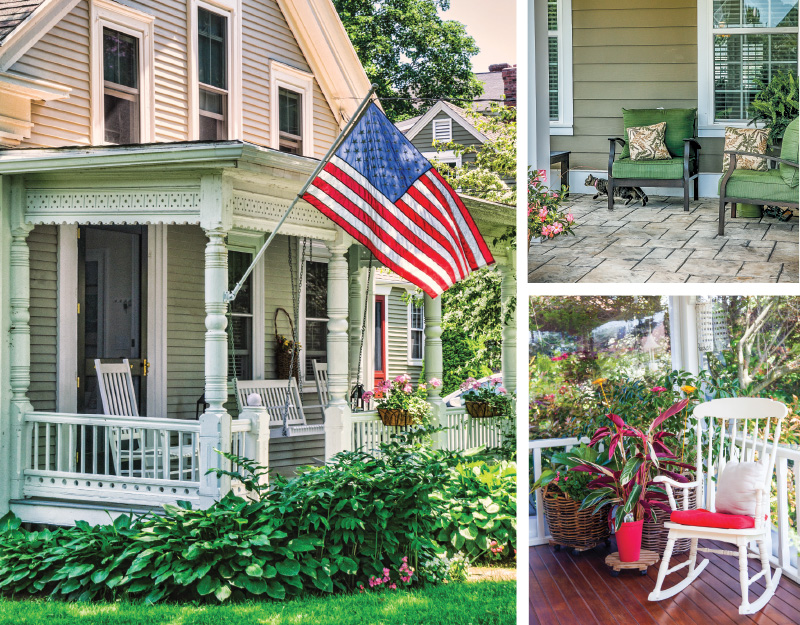
The Front Porch Effect

Why Outdoor Living Still Matters

There’s a particular kind of quiet that happens on a porch in the early morning. The house is awake enough to hum—coffee brewing, a door creaking open—but the day hasn’t fully arrived yet. You sit for a minute longer than you planned. You breathe. You watch light move across the yard. Nothing is urgent, and that’s the point.

Long before outdoor living became a category of furniture or a Pinterest board, porches, patios, and backyards were simply where life spilled out.

They were places to pause and places to gather, rooms without walls that asked very little of us beyond presence. In a world increasingly defined by speed
and screens, these spaces still matter—not because they’re trendy, but because they quietly hold together the rhythms of daily life.

A Room That Belongs to Everyone

The front porch, especially, has always been a kind of social contract. It’s private, but not too private. Public-facing, but gentle. A place where neighbors wave, conversations begin without ceremony, and time stretches just enough to allow connection.

Historically, porches were designed for exactly this purpose. They cooled homes before air conditioning, yes—but they also cooled people. Rocking chairs encouraged lingering. Railings framed views of the street. Steps became seats for kids waiting on friends or adults swapping stories at dusk. Even now, a porch light left on in the evening still sends a quiet signal: you’re welcome here.

Patios and backyards carry that same spirit, just turned inward. Where the porch invites the neighborhood, the backyard gathers the household.

It’s where kids invent entire worlds with sticks and chalk, where dogs find their favorite patch of sun, where dinners stretch later than expected because the air feels kind.

porches

The Rituals That Root Us

Outdoor living spaces endure because they become containers for ritual. Not the grand, ceremonial kind—but the everyday ones that anchor us.

Morning coffee tastes different outside. It’s slower, less transactional. You notice birdsong, the weather, the way your body wakes up when it’s not immediately pulled toward a screen. In the evening, a porch or patio becomes a soft landing place—a transition between the busyness of the day and the quiet of night. Conversations meander. Kids play until the light fades. You sit without agenda.

These rituals matter because they repeat. They mark time. They give shape to days that might otherwise blur together. In seasons of change—new jobs, new babies, new phases of life—these small, consistent moments offer a sense of continuity.

Rest That Isn’t Performative

So much of modern rest has become curated: wellness routines, productivity breaks, optimized self-care. Outdoor spaces offer something simpler. They allow rest without instruction.

You don’t have to do anything on a porch. You can scroll, sure—but you’re just as likely to put the phone down.

You can read half a page and stare off into the distance. You can sit with someone and talk about nothing in particular. This kind of rest isn’t about improvement; it’s about allowance.

There’s also something grounding about being partially exposed to the elements—feeling the breeze, adjusting to temperature, watching clouds roll in.

It reminds us that we’re part of something larger than our schedules and to-do lists. That awareness, subtle as it is, can be deeply calming.

Spaces That Grow With a Family

Outdoor living spaces evolve alongside the people who use them. A porch that once hosted late-night conversations might later hold a swing for a sleeping baby. A backyard that started as a blank slate becomes a patchwork of memories: the tree that held a tire swing, the corner where a garden finally took, the patio where birthdays were celebrated year after year.

For children especially, these spaces are formative. Outdoor play encourages creativity, independence, and a sense of belonging to a place. It’s where scraped knees happen—and where resilience quietly takes root. Long after toys are outgrown, the feeling of those spaces often remains.

Why It Still Matters

At its core, the front porch effect isn’t about architecture or square footage. It’s about permission. Permission to slow down. To be seen without being on display. To connect without scheduling. To rest without justification.

As communities grow more dispersed and lives become more digitally mediated, these spaces offer something increasingly rare: unstructured togetherness. They don’t demand productivity or performance. They simply hold space—for conversation, for quiet, for the ordinary moments that, over time, add up to a life.

You don’t need a sprawling wraparound porch or a magazine-worthy patio to experience it. A small stoop, a folding chair, a string of lights—sometimes that’s enough. What matters most is the intention to step outside, to linger, to let life happen just beyond the threshold of your door.

Because sometimes, the most meaningful moments aren’t planned at all. They’re the ones that happen when you sit down for a minute—and decide to stay.


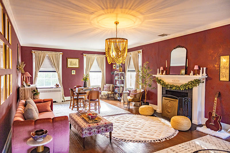
Curated, Not Cluttered

How to strike the balance between styled layers and lived-in comfort—without tipping into chaos here’s a fine line between a home that feels thoughtfully layered and one that feels…busy.

We’ve all walked into both. One feels collected over time, rich with story and texture. The other feels like every surface was filled simply because it could be. The difference isn’t necessarily how much is in the room—it’s how intentionally it’s arranged.

If you love books stacked on side tables, ceramics collected from travels, framed photos, woven baskets, vintage finds, and a healthy mix of new and old, but you worry about crossing into clutter, this guide is for you.

Here’s how to create a home that feels curated, not crowded.

Start with Breathing Room

Before adding anything, step back.

Every well-styled space begins with negative space—the empty areas that allow your eye to rest. Think of it as visual oxygen. Without it, even beautiful objects begin to compete.

As a general rule: not every wall needs art, not every shelf needs to be filled, and not every tabletop needs décor. If you’re styling built-ins, leave a few shelves partially empty. If you’re working with a gallery wall, allow for consistent spacing between frames.

Editing is often more powerful than adding.

©PHOTOS BY DARYL CALFEE

©PHOTO BY DARYL CALFEE

Create Visual Anchors

Clutter often happens when a room lacks a focal point. When everything is competing for attention, nothing stands out.

Choose one or two anchor elements per room:
• A statement light fixture
• A large piece of art
• A bold rug
• A beautifully styled mantel
• A sculptural chair

Once your anchor is established, let the surrounding décor support it rather than rival it. Smaller objects should feel like supporting characters, not co-stars.

Think in Layers, Not Piles

Layering creates depth; piling creates chaos.

The difference? Intention and variation.

Instead of lining up objects of similar height and size, vary scale and shape.

Pair something tall with something low. Combine smooth ceramics with woven textures. Place art behind a lamp or slightly overlap framed pieces on a shelf.
A simple formula to try on coffee tables
or consoles:
1. Something vertical (a vase, candlestick,
or lamp)
2. Something organic (greenery, a bowl of fruit, a branch)
3. Something personal (a book, photo, or collected object)

Three elements often feel balanced without feeling busy.

Photo by Daryl Calfee

©PHOTO BY DARYL CALFEE

Corral the Small Stuff

Small objects are usually what push a room from curated to cluttered.

The fix? Containment.

Use trays, bowls, baskets, or decorative boxes to group smaller items. Instead of five separate candles scattered across a surface, place two or three on a tray. Instead of loose mail on the counter, use a woven basket. Instead of remotes floating on a coffee table, use a lidded box.

When small items are visually grouped, they read as a single design moment rather than visual noise.

Stick to a Cohesive Color Story

Even eclectic homes benefit from a defined palette.

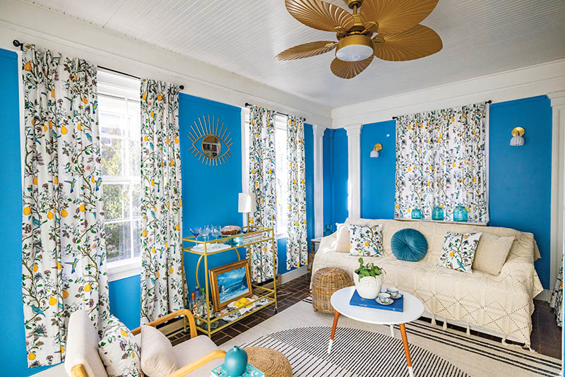
This doesn’t mean everything must match. But choosing a general color direction—warm neutrals, moody jewel tones, soft coastal hues—helps diverse pieces feel connected.

If you’re unsure, look at what you already own. What colors repeat? What tones do you naturally gravitate toward?

Then, when adding something new, ask: Does this complement what’s already here?

When color feels cohesive, layering feels intentional.

Mix Eras—But With Restraint

A home filled entirely with brand-new pieces can feel flat. A home filled entirely with vintage can feel heavy. The magic is in the mix.

Pair an antique wooden chest with a modern lamp. Style heirloom china inside streamlined cabinetry. Hang contemporary art above a traditional console.

The key is balance. If everything is ornate, it becomes overwhelming. If everything is minimal, it lacks warmth. Let contrasting elements enhance one another.

Leave Room for Function

Sometimes what feels like clutter is simply poor function.

Decor should never interfere with daily life. If you’re constantly moving objects to use a surface, that surface is over-styled.

Coffee tables should still hold coffee. Nightstands should still hold a book and a glass of water. Kitchen counters should allow space for meal prep.
When décor supports the way you live—rather than complicates it—your home feels calmer instantly.

Rotate, Don’t Accumulate

You don’t have to display everything at once.

One of the simplest tricks professional stylists use is rotation. Store seasonal pieces or extra décor in labeled bins and swap them throughout the year.
Shelves feel refreshed, and you avoid the slow build-up of excess.

This also allows sentimental objects to shine when they’re displayed—rather than disappearing into visual overload.

Make It Personal (But Edit Thoughtfully)

A curated home tells a story.

Photographs, children’s art, travel souvenirs, inherited pieces—these are the elements that make a house yours. The goal isn’t to remove personality in the name of minimalism. It’s to showcase it well.

Choose your favorite pieces. Frame the art instead of taping it to the fridge.

Give that inherited bowl a place of honor rather than tucking it behind other items. Display collections together instead of scattering them throughout the house.

When personal items are presented intentionally, they feel meaningful—not messy.

Do the “Squint Test”

When you feel unsure, try this: stand in the doorway and squint.

What do you notice first? Does your eye know where to land? Or does it bounce around the room?

If everything feels loud, remove one or two things and reassess. Often, subtracting just 10 percent of a room’s décor dramatically shifts how it feels.

Remember: Curated Doesn’t Mean Perfect

The most beautiful homes aren’t museum displays. They feel lived in.

Books are dog-eared. Throws are slightly rumpled. A stack of mail sits on the desk—contained, but present.

Striking the balance between styled and sincere takes practice. It requires stepping back, editing bravely, and choosing pieces that truly resonate rather than simply fill space.

A curated home isn’t about having less. It’s about choosing well.

And when each object has room to breathe, your home doesn’t just look better—it feels better.


A Home That Doesn’t Perform

In her 1924 Colonial Revival, Mia Mangold has created a space shaped by history, humor, and intention

By: Megan Williams | Photos By: Andria Fontenot

Life changes exponentially when you stop performing and stop caring who’s watching,” Mia Mangold said, standing in the dining room of her 1924 Colonial Revival home—a space layered with collected furniture, hand-upholstered pillows, and just enough evidence of daily life to make it clear no one here is trying to impress anyone.

Mangold laughed, almost as if to soften the weight of the statement. “It took me a long time to actually mean that,” she added.

It’s not a catchphrase she uses lightly. It’s an earned mantra—one shaped over decades of movement, reinvention, and saying yes to experiences that most people only daydream about, then learning when to stop performing altogether.

Mangold bought her Lynchburg home in 2019 after renovating a string of historic houses across the Hill City. The story of those homes—and the life she built around them—is literally displayed on the walls.

Decorative plates from Oxide Pottery line her living room built-ins, each illustrating a house she has owned, loved, and renovated in Lynchburg. She gestures toward them as if they’re old friends rather than milestones (though, to the outsider looking in, they are both).

“I’ve owned seven houses in Lynchburg, plus one in St. Pete [Florida], one in Austin [Texas], and one in New Jersey—so 10 total,” she said. “My first house in New Jersey was built around 1865, and it’s where Walt Whitman used to stay in the summer. There was a natural spring—I picture him sitting down there writing poetry.

It sounds cheesy, but as a kid I was an old soul, weird kid. New Jersey has so many old Victorians.”

To hear her describe her journey—from “old soul, weird kid” who grew up on the New Jersey–Philadelphia line to home renovator in Lynchburg—is to realize that Mangold’s life has never followed a straight line.

It’s shaped by an innate curiosity, a desire to see the world, and a penchant for never saying no to a good time.

“I basically grew up in Philadelphia,” she said. “I lived 15 minutes away in New Jersey, near the Ben Franklin Bridge. Then I left for a while—lived in a car with my friends and went cross-country, ended up in San Francisco. I came back when I was 21 because my grandma got really sick. We thought she was going to pass, but she lived four more years and couldn’t be alone. I spent days with her; my mom slept there at night. I worked while getting my photography degree—I was a photo lab tech—and I worked at the Camden County Library in periodicals. I even worked at Staples, which was fun.”

By 24, Mangold had saved up enough money to buy her first home. It was then, staring down the beams of a 19th century Victorian, that her gumption grew even more.

“I didn’t have YouTube tutorials. I had old home and garden handyman books that taught me how to change a faucet or fix something,” she remembered, nodding to the corner bookshelf where her handyman books still reside. “My uncle worked at a lumber yard—he helped me with trim and molding.”

At the same time that she was teaching herself how to renovate her New Jersey home, she was also working at the historic Trocadero Theatre in Philadelphia’s Chinatown, where she worked until she turned 30. While she loved working as a concert promotor and then later a booking agent, the early load-ins and late-night shows eventually became too much. The housing market in New Jersey was booming and Mangold took a chance and sold her house.

“The housing market got high—when balloon loans were everywhere and rates were low—and I sold my house for three times what I paid,” she said. “Then I flew to Spain and didn’t come back for two years. I lived in Turkey, spent a lot of time in Greece, went to Australia, Asia… India for a while because it was affordable and I could stay longer. I was saving money because I knew I’d have to come back eventually and I wanted to buy another house.”

And she did.

After flying to Austin, Texas, for a wedding, Mangold planted roots once again—working at the legendary Red 7 venue, popular for hosting rock, punk, and metal shows. She also purchased a condo, which she sold a few years later for enough money to buy her first 5,000-square-foot home in Rivermont—with enough money left over for renovations.

“I saw a house online—I think it was on Madison—and I was like, ‘Where is this place?’ I thought: Is this magical fairyland? I could buy two old houses for what I could sell my one house for. So I made a list of 10 houses, found a local realtor, and she showed me all of them. I chose the Rivermont house—the big white house—it had an apartment in the back and had been a rooming house. It was fun to renovate. I was still tiptoeing into color because I was accommodating guests. I rented downstairs as an Airbnb. I didn’t want an all-white Airbnb with the same horse picture everyone has. I wanted it to feel interesting—bright, funky—something you don’t live in every day.”

From there flowed a series of home purchases and renovations—some of which she held onto for a time as short-term rentals, and others she lived in or sold. All the while, Mangold was rolling up her sleeves, doing the work herself, and evolving her style even further.

“On Arlington [Street], I was taking out a vanity and the plumbing was corroded—it broke off and sprayed everywhere. I’m soaked, running into the basement, crawl space… water pouring everywhere—hardwood floors exposed,” she remembered, noting that the journey has been far from picture perfect, and that’s exactly how she’d prefer it. “Or when I moved here [to this house] the plumbing started leaking so I had to go in and fix it, patch the wall, put up a new ceiling… a week later, water’s dripping out of the vent. That stuff happens.”

Mangold doesn’t shy away from the uncomfortable. Rather, those messy moments are what make her story all the more interesting and all the more relatable. A small woman in stature, her lived experiences have made her a force of will and determination.

And it’s an interesting juxtaposition—the know-how to fix plumbing and patch the wall alongside of the person who can effortlessly style a room all while wearing vintage Doc Martens that have been meticulously preserved since the ‘80s.

Mangold’s life has never followed a straight line, and she has no interest in pretending it should have. The houses, the travel, the work—even the setbacks—have all been part of the same ongoing experiment: figuring out what feels honest, useful, and worth keeping.

In her Lynchburg home, there’s no performance—only layers of intention, curiosity, and care. It’s a place where old windows are left intact, mistakes are patched and repatched, and nothing is precious unless it’s personal.

For Mangold, that’s the point. Not perfection, not polish, just a life and a home that reflects exactly who she is, right now.


Rescuing Banister Town Tavern

One man’s journey to deconstruct and rebuild a 18th-century tavern

By: Megan Williams / Photos By: Ashlee Glen

Every small town has its ghosts. In Halifax, one of them was the Banister Town Tavern—an unstable and uninhabitable 18th-century inn whose walls once sheltered travelers, debates, and dreams of revolution. When the structure’s timbers began to fail, most assumed its story had ended. But local preservationist Christopher “Todd” Hunley saw something different: a chance to keep a piece of Virginia’s past standing, one beam at a time.

Those local to Lynchburg know Hunley as the face behind the counter at Buzzard’s Roost Antiques, the antique shop that he and his wife own and operate. But Hunley wears many proverbial hats—historian, antique collector and shop owner, Sheriff First Sergeant with the City of Lynchburg, and doting father to a six-year-old son.

Hunley has always wanted to live in a Federal-style period home. He has also always wanted to live on his property in Pittsylvania County.

“But my property doesn’t have a Federal period home on it,” Hunley laughed, “so my only solution was to bring an old house to my property.”

So that is exactly what Hunley is doing.

Hunley had been vocal about his interest in finding a Federal-period home to live in, renovate, or disassemble and move, so when friends caught wind of the fate of the Banister Town Tavern—also often referred to as Bell Tavern—in the Town of Halifax, they immediately called Hunley.

“The home had become extremely unstable,” he said. “If I hadn’t done this with the Town of Halifax, the tavern would have met the fate of the bulldozer.”

Hunley toured the Banister Town Tavern. He took in its weathered pine boards, its leaning timbers, its overgrown lots.

“It wasn’t a candidate for restoration,” Hunley said. “The sills were rotted through; the basement had been backfilled to avoid structural collapse.”

Hunley made an offer to the Town of Halifax, which included a detailed plan to disassemble the tavern and move the materials 48 miles away to his property. The Town of Halifax accepted, seeing Hunley’s proposal as a way to preserve the structure without losing its story.

“That little house still had life in it,” Hunley said. “It played a vital part during such an instrumental time in our country…and I couldn’t let it disappear.”

Much of the tavern’s history has been lost to time, but the house, as Hunley refers to it, was originally Banister Town Tavern, with Banister Town being the settlement in that area before Halifax was established. Originally constructed between 1760 and 1770, with an addition added in the early 1800s, it’s estimated that Banister Town Tavern was once a bustling establishment.

In the mid- to late-1700s, what is today Route 501 was a main stagecoach route for those venturing from New York to New Orleans, so it was common for taverns to be peppered throughout the route to meet the demands of the stagecoach travel. According to Hunley, horses could only travel a maximum of 30 miles per day, so many stops were essential along the way.

“Most people today think a tavern was just a bar,” Hunley explained. “But in the 18th century, a tavern was the heartbeat of a community.”

The Banister Town Tavern functioned as a lodging house, meeting place, and community hub. It would have been a place for respite, a meal, and a place for horses to be rested and watered.

“Local folklore claims that George Washington may have stopped there, but of course that is just legend—there is no physical proof that it happened, but it is certainly plausible,” he said.

When Hunley began disassembling the tavern, he found a letter written in 1823—mouse-eaten and in tatters—from a brother to his sister, who was living in the tavern. He also found a rosette in the same wall that would have been from a uniform from the War of 1812.

“I was really hoping to find artifacts left behind,” Hunley said. “Tons of stuff was in the walls from the 1980s, which was the last time the house was lived in. But I still haven’t gotten into the basement, so I’m hopeful to find artifacts from when the house was first built.”

For Hunley, the dismantling was an act of both preservation and patience.

The home had waited long enough.

Now it was time to save what was left.

Dismantling the tavern, to say the least, has not been easy. To date, Hunley has removed 70 tons of plaster, lath, and debris, all of which has been removed by hand in an effort to save as much of the original material as possible.

On estimate, Hunley has saved 70 percent of the main structure and 85 percent of the addition. The timbers that aren’t structurally sound enough to be reassembled as his home will be repurposed for out buildings, such as a traditional smokehouse.

“Rebuilding this tavern isn’t cheaper than building something new,” he said. “But the materials tell a story that you can’t replicate today.”

Hunley’s passion for history runs deep, fueled by a lifelong fascination with the tangible past and the belief that every artifact, no matter how weathered, has something to teach us. He’s meticulously documenting the entire process of the tavern’s dismantling and reconstruction, not only as a guide for the rebuild but as a record of its continued life.

“I’m preserving this for the same reason I collect antiques,” he said. “These things tell the story of who we are. If we don’t take the time to understand where we came from, we lose part of ourselves.”

The project has also become a kind of inheritance. Hunley often says that while the tavern may one day stand on his land, it doesn’t really belong to him—it belongs to the continuum of history, to the people who built it, and to those who will stand inside it long after he’s gone. Each board he saves, each joint he restores, keeps a connection alive between past and present.

For the Town of Halifax, the partnership represents a rare success story—proof that preservation doesn’t always mean leaving something in place. It can also mean giving it the chance to live again.

“The town has been incredible,” Hunley said.

“They didn’t want to see this piece of history lost, and neither did I.”

When the Banister Town Tavern rises once more—this time among the rolling fields of Pittsylvania County—it will stand as a testament to resilience, craftsmanship, and the enduring pull of stories worth saving.

More than two centuries after it first opened its doors, the Banister Town Tavern is traveling again—carried beam by beam, memory by memory, toward a new beginning. And like the generations who once passed through its halls, it’s bound not by where it stands, but by the history it keeps alive.

RELATED CONTENT:

Restoring Red Hill

Stewards of Ivy Cliff


2025 Lynchburg Living Idea House: West Coast Meets Lake Coast

This year’s Lynchburg Living Idea House is a blending of aesthetics and charm

By: Megan Williams | Photos By: Ashlee Glen

From the sloped driveway—towering oaks, poplars, and hickories parting just enough to make space for a car or maybe a trailer pulling a heap of kayaks—the white modern house looks quaint. As you creep down the drive, acorns popping under your tires, what may have appeared unassuming from the main thoroughfare changes view. The stucco-style exterior, clean lines, and floating concrete steps are your first indication that this isn’t your typical lakefront home.

“You don’t see many West Coast style homes like this on the lake,” said Scott Elliott, President and Head of Design Services at Custom Structures, the team behind the brand-new build at Smith Mountain Lake.

And, sure enough, the home has gleaned a considerable amount of its architectural style from our neighbors across the country. There is a deep connection to nature on the roughly one-acre lot. To the left of the back decks—of which there are three—is a resilient hickory, trimmed to a stump decades ago, which now rises again in triplicate, three identical trunks stretching toward the sky.

“We could have taken the tree out,” Meredith Elliott, Scott’s wife and owner of Southern Charm Interior Design, said. “But just look at how it shades the space. I can envision a tree house being added there one day.”

Mere footsteps away, water ebbs in a quiet cove. The water is over 20 feet deep, making the area ideal for a quiet retreat or families hoping to safely splash in the lake. Stepping out onto a back deck, you would never know that you’re less than one mile from Halesford Bridge and Bridgewater Marina. A hawk circles high overhead, birdsong rings from the dozens of trees peppering the property, and you’re greeted with crisp, resounding silence.

But it’s more than its nod to nature that gives this home its West Coast vibe. Linear lighting, open floor plans, expansive windows, flat roof, and wood and stone surfaces are all integral to the West Coast style and are all prominent here.

“I’ve always wanted to build a West Coast-style house,” Scott said, leaning against the black marble kitchen counter. “Since I was a little kid, I have been fascinated by them. But we didn’t have a ton of clients interested in them.”

So, when the land adjacent to one of the Elliott’s current rental properties came available for sale, the Elliotts snatched it up and began envisioning the home.

“I wanted a lot of sleek lines, not too much detail,” Scott recalled. “It’s one of those things where less is more.”

“Once Scott showed me the plans he had for the house, right away I knew the type of style I wanted the interior to have,” Meredith added. Despite having the vision instantly in mind, it took nearly two years to acquire each decor piece for the home—from sourcing a vintage wooden boat from Facebook Marketplace to repeat trips to Home Goods to curate the large collection of bird prints that are styled throughout the space.

Despite its small footprint, the home boasts a shocking amount of livable space.

“You wouldn’t believe this house sleeps 22,” Meredith said.

Just like the home’s architectural style borrows from West Coast and Scandinavian influences, its use of space is influenced by those styles as well. Four bedrooms, one bunkroom, three living rooms, three full baths, and one powder room are scattered throughout the three floors alongside three deck spaces—for lounging and soaking in the lake breeze or for an al fresco meal in the shelter of towering oaks.

When the Elliotts were dreaming up this space, they wanted an environment where families could come together under one roof and live, sleep, and dine comfortably.

“We just had this vision of three or four families coming together for the holidays or a summer vacation and having everything they need, right here, without renting out a huge mansion,” Meredith continued.

The Elliotts plan to rent the home out to short term renters and even envision renting the space out to private chefs hoping to host an intimate dinner party.

The space is made for entertaining with a top-of-the-line ZLINE range, black marble countertops, and a large dining room table and equally expansive bar that looks out at the tree-studded woods.

And just as the Elliotts envision a home where families and friends can come together, they have created a space that will tell those stories over time. In the kitchen, a sweeping copper backsplash runs from counter to ceiling, gathering patina with age.

“We treated the copper backsplash to jumpstart the patina process,” Scott explained. “But it will continue to change and evolve over time.”

What makes this home so special are those intricate details—no proverbial stone left unturned to ensure the space is cozy yet memorable. Even the cooling system has character. Nine mini-splits are hidden throughout the rooms, covered by linen art so the untrained eye would never notice them—but they’d feel their presence.

“Mini-splits are incredibly energy efficient,” Scott explained, “so each room will cool down incredibly quickly—and quietly.”

As the sun dips behind the trees and light filters onto the copper backsplash, it’s clear the Elliotts have built more than a vacation home—they’ve created a space that celebrates the meeting of contrasts: sleek and natural, minimal and warm, modern and timeless.

“We want people to see what’s possible here,” Meredith said. “You can have modern design without losing that sense of warmth.” And standing on the deck, surrounded by oaks and open sky, you can’t help but agree—this is a home that redefines what lakefront living can look like.

To see all the photos and partners go to: 2025 Lynchburg Living Idea House


23rd Annual Gift Guide

Look What I Found

Not sure where to start with that holiday shopping list? You’ve come to the right place!

Our annual Holiday Gift Guide is an overview of unique gift ideas, all found from local businesses. So you’ll not only feel good about what’s under the tree, but you’ll also know your purchase helped support the local economy.


Photo Finishes

Thinking about replacing or refurbishing your kitchen cabinets? Here is a designer’s guide to finish types, colors, and combos

By Jaime Simpson

I could happily discuss cabinets all day. There is just so much to love about them! Cabinets provide storage, allow for a higher level of organization and make items easier to access (especially with inserts and gadgets).

And that is just the functionality. There is a plethora of style and finish options available to put the icing on the cabinet cake.

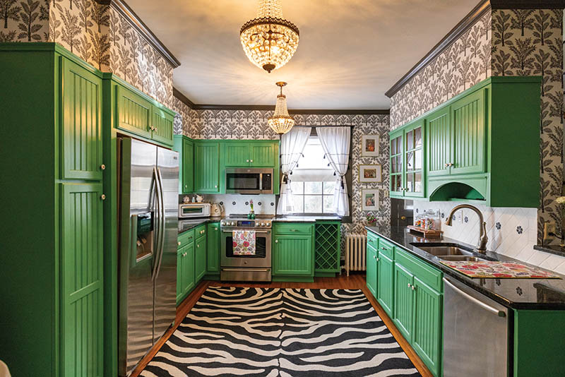
The main finish options for cabinetry are stained, painted or laminated. Metal cabinet doors are increasing in prominence as well, especially for outdoor kitchen spaces.

Stained cabinetry is available in many wood species and in many colors. Warm, cool, light, medium and dark stains can be achieved depending on the preferred look. Most cabinet manufacturers offer paint colors in white, grey, blue and an off white/cream/ecru look. Other colors are available depending on the customization options, while fully custom cabinetry has no limit on paint color options.

Laminated cabinet doors are typically constructed of a plywood core with a laminated surface; these laminates can offer a modern wood grain look, texture or high gloss effect that cannot be easily achieved with wood or paint.

Each finish type has its own beauty and glory. Though one finish and color throughout a kitchen space is lovely and can be a timeless look, you don’t have to choose just one.

Here I have included some thoughts about how to approach using one or more finishes and colors.

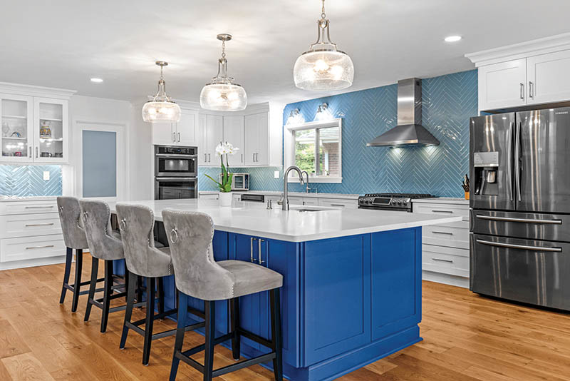
One Cabinet Finish/Color / Top Photo Courtesy of Accent Kitchens, Photo By David Uhrin

  • Use this option if you are looking for a classic and streamlined look.
  • Consider pattern or texture in the countertop and backsplash to provide interest.
  • Choose flooring that provides contrast with the cabinetry.

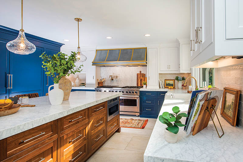
Two Cabinet Finishes/Colors

  • Start with one main finish—whether stain, paint or laminate.
  • Use the second finish/color as an accent or highlight—perhaps the island, base cabinetry, or tall cabinetry.
  • Look for a backsplash or countertop that can unify the two finishes.
  • Find a flooring option that can still contrast both cabinet finish options.

Three Cabinet Finishes/Colors

  • Start with one main finish in this case as well. Use the second finish as a more prominent accent, and the third finish in smaller doses.
  • Stay more subdued with the countertop and backsplash patterns so the various elements don’t compete.
  • Find flooring with minimal pattern, and that coordinates with the third finish.
  • For example, the base and wall cabinetry are the main finish (a white paint) the island and range hood are the second finish (a sage green paint), and floating shelves are a third finish (a walnut stain).

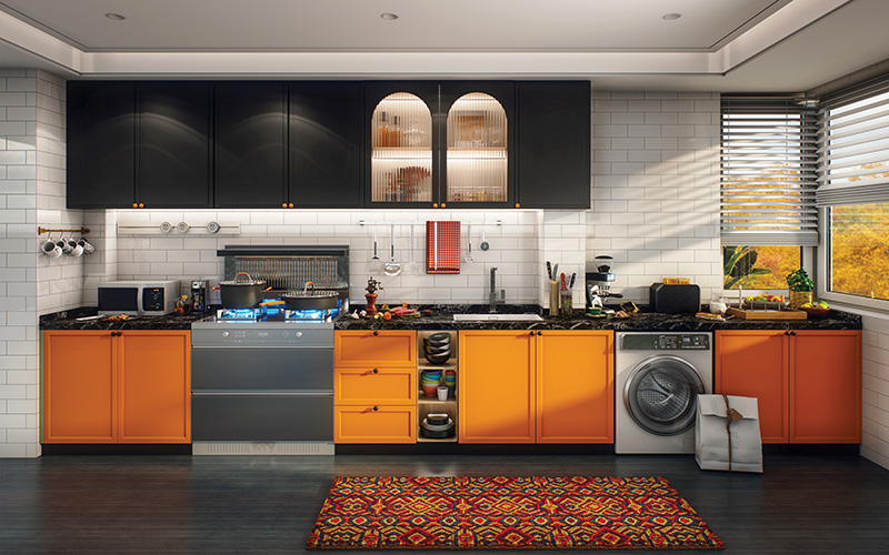
Four Cabinet Finishes/Colors

This is where it gets really fun.

  • If you love eclectic and maximalist styles, don’t be afraid to mix it up.
  • Contrast is the key here—ensure that all the finish tones are clearly different and defined to maintain the presence of each.
  • For example, the base cabinets could be one paint finish (blue), the wall cabinets another paint finish (white), the range hood could be a third paint finish (black), and the island cabinetry could be a contemporary wood-grain laminate (zebra wood).


The Case for Keeping It

Rethinking the Renovation Mindset

It’s easy to get swept up in the promise of a fresh start. The blank slate. The trendy backsplash.

The Pinterest-worthy after photo. But what if the most compelling, most personal design choice you could make wasn’t new at all?

As the renovation boom continues across the country, many homeowners are beginning to rethink the impulse to gut, replace, or cover up what’s already there. Whether it’s original tile, natural wood trim, a quirky built-in cabinet, or an antique fireplace, there’s a growing movement toward preservation—and for good reason.

Holding onto original features isn’t just about honoring the past. It’s about embracing character, sustainability, and in many cases, a better return on investment.

Before you pick up the sledgehammer, it might be worth asking: What’s worth saving?

Embracing the Charm of Imperfection

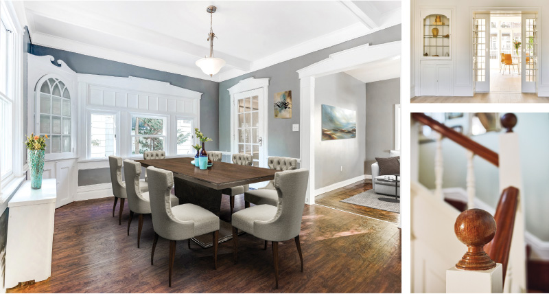
The truth is, older homes were built differently—and often more durably. Solid wood doors, hand-crafted trim, plaster walls, and detailed millwork can be difficult and expensive to replicate today. Even common elements, like mid-century tile or built-in shelving, were designed with a level of intention that mass-produced materials sometimes lack.

There’s a soul to an old house. When you walk in and see worn hardwood floors or a creaky staircase, there’s a story.

Those imperfections can be beautiful if you let them be.

Preserving original features can create a layered, lived-in feel that brings depth and authenticity to a space. It can also help your home stand out in a sea of renovations that often follow the same trends.

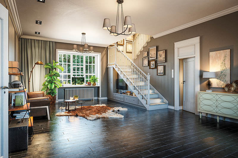
Digitally generated elegant Scandinavian style home interior scene.The scene was rendered with photorealistic shaders and lighting in Autodesk® 3ds Max 2020 with V-Ray 5 with some post-production added.

Digitally generated elegant Scandinavian style home interior scene.
The scene was rendered with photorealistic shaders and lighting in Autodesk® 3ds Max 2020 with V-Ray 5 with some post-production added.

From Functional to Focal Point

Rather than viewing older elements as obstacles to be updated, consider how they might become focal points instead.

Take vintage tile, for example. That powder blue bathroom tile from the 1950s might not match your usual aesthetic—but with the right supporting elements, it can become a retro-chic statement. Brass or matte black fixtures, white walls, and minimal accessories can help highlight the tile rather than fight against it.

The same goes for original fireplaces. Instead of covering up a dated mantel or painting over brick, lean into it. Restore the wood, limewash the brick, or simply keep it as-is and let it ground the room with texture and warmth.

Sometimes the best design decision is doing nothing at all. Or doing just enough to protect and showcase what’s already there.

Tips for Thoughtful Preservation

If you’re ready to rethink your renovation mindset, here are a few ways to preserve character while still meeting modern needs:
1. Restore, Don’t Replace
Refinish wood floors rather than replacing them. Strip and reseal original doors or trim. If cabinets are solid wood, consider repainting or refacing rather than tearing them out.

2. Blend Old and New
Let original features shine by surrounding them with modern, minimal design. A sleek sofa or contemporary light fixture can balance the patina of an older space.

3. Respect Scale and Proportion
Many original elements—like doorways, ceilings, or moldings—were designed with specific proportions in mind. Keep additions and updates in harmony with those original lines for a cohesive look.

4. Update Function, Not Just Style
Keep that quirky built-in, but make it useful—add lighting, repaint the interior, or use it for a modern purpose like barware or board games. You can also retrofit older cabinets with soft-close hardware or install energy-efficient inserts in old windows.

5. Salvage and Reuse
If you must remove something, consider salvaging it for another part of the house—or donating it to a local reuse center. Vintage materials are not only valuable but often higher in quality than what’s available today.

Sustainability and Storytelling

Choosing to preserve instead of replace is also a deeply sustainable choice. Demolition and new materials contribute to landfill waste and increased carbon emissions. In contrast, restoring what already exists minimizes waste and often reduces overall renovation costs.

And then there’s the emotional value. That worn banister your child slides down every morning. The original transom windows that let in just the right slant of afternoon light. These elements tell a story—your home’s and your family’s.

When you live in a space that’s not perfect but has a history, it grounds you.

You become part of something bigger than just the latest trend.

When to Let Go

Of course, not everything can or should be saved. Water damage, mold, structural issues, and hazardous materials like lead paint or asbestos may require removal for safety reasons. In some cases, preservation isn’t practical—and that’s okay.

But for everything else? It’s worth pausing before you replace.

The best homes often reflect a balance between old and new, polished and worn. They evolve slowly, lovingly. And sometimes the most meaningful design choice isn’t about what you add—but what you choose to keep.

5 Original Features Worth Saving

Before you demo, take a second look—these vintage details can add charm, value, and character to your home.
1. Hardwood Floors
Even if they’re scuffed or hiding under carpet, original wood floors are often solid and salvageable. Refinishing can restore their luster and preserve their timeless appeal.

2. Trim and Molding
Crown molding, picture rails, baseboards, and window casings add architectural depth. Solid wood trim is hard to replicate and worth keeping whenever possible.

3. Built-In Cabinets or Nooks
From hallway linen closets to breakfast benches and phone niches, built-ins offer functional storage and personality. Fresh paint or hardware can give them new life.

4. Original Doors and Hardware
Solid wood doors—especially those with panels or glass—are sturdy and stylish. Keep the vintage knobs and hinges for added character (or clean them up for a polished antique finish).

5. Fireplace Surrounds
Whether brick, stone, or tile, an original fireplace brings warmth and texture to a space. Even a non-functioning fireplace can serve as a cozy design anchor.

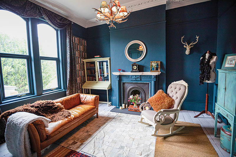
Drawing room with high ceilings and architectural features

Drawing room with high ceilings and architectural features